Bootstrap 5 Input Group
Wir können.input-groupdie Klasse verwenden, um Formulareingabefeldern weitere Stile hinzuzufügen, wie Symbole, Text oder Schaltflächen.
.input-group-textKlasse, um den Stil des Textes festzulegen.

Bootstrap-Beispiel
<form>
<div class="input-group mb-3">
<span class="input-group-text">@</span>
<input type="text" class="form-control" placeholder="Benutzername">
</div>
<div class="input-group3input">
<input type="text" class="form-control" placeholder="Ihre E-Mail">
<span class="input-group-text">@example.com</span>
</div>
</form>
Selbst ausprobieren »
Größe von Eingabegruppen
Verwenden Sie.input-group-smals Klasse, um eine kleine Eingabegruppe festzulegen,.input-group-lgals Klasse, um eine große Eingabegruppe festzulegen:
Bootstrap-Beispiel
<div class="input-group mb-3 input-group-sm">
<span class="input-group-text">Klein</span>
<input type="text" class="form-control">
</div>
<div class="input-group mb-3">
<span class="input-group">Standard</span>
<input type="text" class="form-control">>
</div>
<div class="input-group mb-3 input-group-lg">
<span class="input-group-text">Groß</span>
<input type="text" class="form-control">
</div>
Selbst ausprobieren »
Mehrere Eingaben und Text
Bootstrap-Beispiel
<div class="input-group mb-3">
<span class="input-group-text">Person</span>
<input type="text" class="form-control" placeholder="Vorname">
<input type="text" class="form-control" placeholder="Nachname">
</div>
<div class="input-group mb-3">
<span class="input-group-text">Eins</span>
<span class="input-group-text">Zwei</span>
<span class="input-group-text">Drei</span>
<input type="text" class="form-control">
</div>
Selbst ausprobieren »
Checkboxen und Radio-Buttons
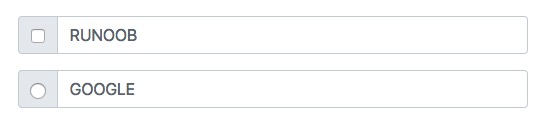
Textinformationen können durch Kontrollkästchen und Optionsfelder ersetzt werden:
Bootstrap-Beispiel
<div class="input-group mb-3">
<div class="input-group-text">
<input type="checkbox">
</div>
<input type="text" class="form-control" placeholder="BEISPIEL">
</div>
<div class="input-group mb-3">
<div class="input-group-text">
<input type="radio">
</div>
<input type="text" class="form-control" placeholder="GOOGLE">
</div>
Selbst ausprobieren »
Button-Gruppen zu Eingabegruppen hinzufügen
Bootstrap-Beispiel
<div class="input-group mb-3">
<button class="btn btn-outline-primary" type="button">Einfacher Button</button>
<input type="text" class="form-control" placeholder="Etwas Text">
</div>
<div class="input-group mb-3">
<input type="text" class="form-control" placeholder="Suchen">
<button class="btn btn-success" type="submit">Los</button>
</div>
<div class="input-group mb-3">
<input type="text" class="form-control" placeholder="Etwas Cleveres..">
<button class="btn btn-primary" type="button">OK</button>
<button class="btn btn-danger" type="button">Abbrechen</button>
</div>
Selbst ausprobieren »
Dropdown-Menüs
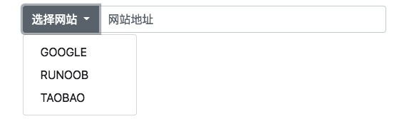
Das Hinzufügen eines Dropdown-Menüs zu einer Eingabegruppe erfordert nicht die Verwendung der .dropdown-Klasse.
Bootstrap-Beispiel
<div class="input-group mt-3 mb-3">
<button type="button" class="btn btn-primary dropdown-toggle" data-bs-toggle="dropdown">Website auswählen</button>
<ul class="dropdown-menu">
<li><a class="dropdown-item" href="https://www.google.com">GOOGLE</a></li>
<li><a class="dropdown-item" href="https://www.example.com">BEISPIEL</a></li>
<li><a class="dropdown-item" href="https://www.taobao.com">TAOBAO</a></li>
</ul>
<input type="text" class="form-control" placeholder="Website-Adresse">
</div>
Selbst ausprobieren »
Eingabegruppen-Beschriftungen
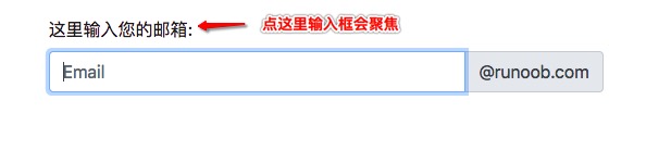
In einer Eingabegruppe können Sie eine Beschriftung festlegen, indem Sie eine Beschriftung außerhalb der Eingabegruppe platzieren. Das for-Attribut der Beschriftung muss der id der Eingabegruppe entsprechen. Ein Klick auf die Beschriftung fokussiert das Eingabefeld:
Bootstrap-Beispiel
<form>
<label for="demo">Geben Sie hier Ihre E-Mail-Adresse ein:</label>
<div class="input-group mb-3">
<input type="text" class="form-control" placeholder="E-Mail" id="demo" name="email">
<span class="input-group-text">@example.com</span>
</div>
</Form>
Selbst ausprobieren »
Andere Erweiterungen